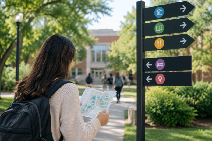

A campus can have a sign on every corner and still have a crowd of confused freshmen on the first day of class. The signs are there. They match the school colors, and someone paid good money for them. Yet a new student still stops a stranger and asks, “Do you know where Whitmore Hall is?”
A sign being present is not the same as a sign being useful. Here’s where the gap usually opens.
They Don’t Know the Names
A student’s schedule says “Whitmore 214.” Nobody has told them what Whitmore is, what it looks like, or which side of campus it sits on. Signs list buildings by name, but it’s a different language to someone who’s been on campus for only forty-five minutes.
Returning students carry a map in their heads. They know the “Science Building” is the tall brick one by the library. First-years have huge question marks hovering above them. Thus, a sign pointing to “Whitmore Hall” says very little. It’s like a street sign in a city where you don’t know a single street.
Good campus wayfinding solutions tie names to something a newcomer can see. They use a color or a short descriptor under the building name. For example, a sign that says “Whitmore Hall, Chemistry and Biology” helps far more than the name alone.
Signs Sit Where There’s Space
If this is how signs were placed, it definitely can’t be seen by those who needed them. It should be where people decide, and it’s usually at the fork in the path. Placing these supposedly helpful signs in empty spaces is like a lazy job. It’s clean and printed, but it doesn’t serve its full purpose because they’re at points where passersby don’t need them.
Try this: walk the main paths as a new student would, and stop at every spot where the path splits. Is there a sign right there? Can you read it before you commit to a turn? Often the answer is no.
Height and angle matter too. A sign facing the road is no use to someone on the footpath beside it. A student with a backpack and a coffee isn’t scanning the skyline. Sometimes, people check their phones as they look around for signs. Looking up? That’s usually the least they’d do.
Too Much on One Sign
A sign with twelve arrows is hard to read on a calm day. First-years are usually nervous and holding a schedule in one hand. They’ll read the first two or three lines and give up.
Keep each sign to the destinations people look for most. Put the full list on the map at the entrance. Offices and departments compete with building signs. To a newcomer, that looks like noise, and they’ll probably look away.
The Map and the Ground Don’t Match
Most campus maps are drawn from above with north at the top. A student on the ground has no idea which way north is. So they turn the map around in their hands and still can’t tell what they’re looking at.
A “You Are Here” dot only helps if the map is turned to match what the student sees in front of them. If it isn’t, they’ll walk the wrong way with complete confidence.
Phone maps help, but not always. GPS can get a student to the right building. It can’t say which door to use, which floor the room is on, or that the building has three wings and the room is in the one at the back. Plenty of freshmen reach the right address and still stand in the lobby, lost.
Buildings Are Hard to Read From Inside
Sometimes, only the front door holds the navigation clues. For a building with room numbers that skip floors and hallways that look the same, they’d push people into going back from where they started. It slows them down, and you get a lot of people going back and forth. In older buildings, room 214 might be on the second floor of one wing and the third floor of another. This is the reason why mall escalators would have a G or a number 2 or 3 engraved or printed somewhere that can be seen easily.
A simple floor directory near each entrance and elevator also makes a big difference. Number systems should follow a pattern, with the first digit matching the floor. If a building can’t follow that rule, the entrance sign should say so in plain words.
Orientation Week Comes Too Early
Colleges, particularly those that know their campus is like a labyrinth, hand out maps in the first week. Sometimes, they would even host live tours. Although a clever effort, students find themselves nodding to whoever is facilitating the orientation. But in their heads, they are too overwhelmed with concerns about housing, meals, roommates, etc. Those nods don’t guarantee that it’ll all remain in their heads.
Signage works best at points where students ask themselves a question like, “So where do I go now?” That’s where answers are most helpful.
Put a QR code on the sign outside each building that opens the walking route from the nearest main path. Add a short line of directions to the class reminder email. Give students the answer when they’re standing there looking confused.