
A short animation for a cheerful weekend feature does not necessarily need dramatic fog, polished marble, and a camera sweeping through a vast room. A few shapes cut from coloured paper might express the idea more clearly. The expensive-looking treatment is not automatically the appropriate one.
That choice matters when working with AI video. “Cinematic” is easy to add to a prompt, but it leaves a large creative question unanswered: what should this particular piece feel like? An illustrated scene, a handmade-looking animation, and a photographic scene invite different expectations from the viewer.
With Wan 3.0, creators can explore those choices through text, image, and reference-based video generation. The linked service is Wave AI, an independent platform rather than an official model-provider website. Here, the useful exercise is choosing a visual language for a simple idea—not treating one aesthetic as a measure of the tool’s quality.
Choose the feeling before the finish
Consider an invented visual for a magazine feature about making time for a creative break: a closed notebook opens, and a small arrangement of coloured shapes appears around it. There is no real brand, product claim, or named person to reproduce.
If the feature is light and playful, a paper-based treatment could fit. If it is reflective, a restrained illustration might be more appropriate. If the intention is to show the appearance of an actual notebook, a stylised invention is no substitute for accurate photography.
Write a short description of the intended feeling without naming a visual medium. “A small invitation to stop and make something” gives the designer a purpose. “Make it premium” leaves much more room for a result that is attractive but emotionally wrong.
The same distinction applies to social posts, editorial introductions, and creative portfolios. A visual treatment should match the promise of the piece, not simply demonstrate how much detail a generator can produce.
Paper, illustration, and photography make different promises
A paper-like treatment makes the construction visible. Layered edges, simple folds, and soft shadows can suggest something assembled by hand. For the notebook idea, coloured paper circles might emerge one at a time rather than arrive as a glossy burst of particles.
Describe those visible qualities directly. “Cut-paper shapes with visible edges and a limited palette” is more informative than “creative style.” If the animation is AI-generated, describe it as paper-inspired rather than claiming it was physically made or filmed using stop-motion.
An illustrated treatment leaves room for interpretation. Flat colour, a loose line, or a softly painted surface can keep the scene expressive without pretending that the notebook exists as a photographed object. The motion can be modest: a page turns, a drawn shape stretches, or a patch of colour gently spreads.
It helps to choose which graphic qualities matter most. A request for rough pencil marks, glossy reflections, flat vector colour, and photographic skin texture would send the scene in several directions. More style words do not necessarily create a more coherent style.
A photographic treatment invites closer scrutiny of physical details. Viewers can inspect how the cover bends, how shadows fall, and whether the pages behave plausibly. Use this direction when those details contribute to the idea. For an actual product, use accurate source material and check that generated motion has not changed its construction or appearance.
Give the material a suitable kind of movement
The notebook opening is the same event in all three versions, but it need not happen in the same way. Paper-inspired shapes might unfold in distinct steps. An illustration might move with a softer, simplified gesture. A photographic version may call for an ordinary page turn with little else happening.
For a paper-inspired concept, a suggested request could be:
An original closed notebook on a plain warm background. The cover opens, and three coloured cut-paper circles unfold beside it. Visible paper edges, soft shadows, a limited palette, and gentle movement. Keep the notebook easy to recognise. No lettering or logos.
This is an illustrative prompt, not a tested result or a promise of precise animation control. Its purpose is to connect the movement with the chosen material. If the circles melt into liquid, the output may be interesting, but it has departed from the paper idea.
Keep the artwork’s character when adding motion
Sometimes the right treatment already exists in an original illustration. A designer has drawn the notebook with uneven outlines and deliberately simple colours. Starting again from a text description could lose precisely what makes the drawing appealing.
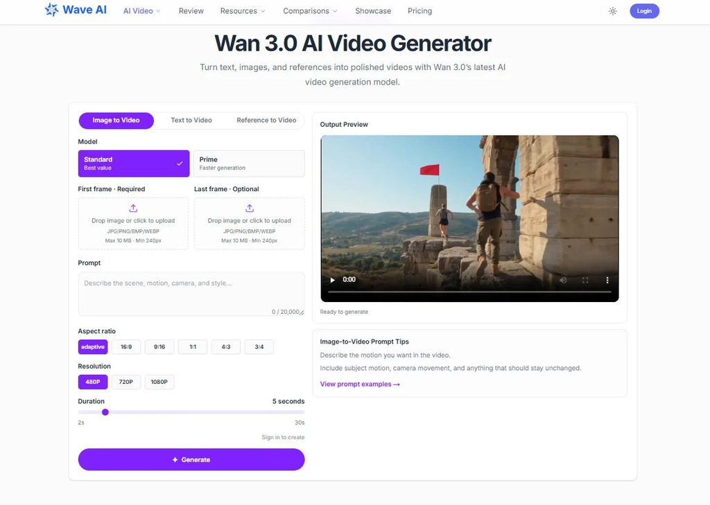
The Wan image-to-video workflow provides a way to use that artwork as visual guidance while describing the movement. Ask for the action the image needs, rather than a general enhancement. A small cover movement may suit the drawing better than a camera orbit that requires unseen surfaces to be invented.
Inspect whether the result still belongs to the same visual family. Are the lines becoming glossy edges? Has the limited palette acquired dramatic lighting? Has the notebook gained details the artist deliberately left out? Those changes are not automatically improvements.
Use original references or materials cleared for external AI processing and the intended publication. Permission to save an image for inspiration does not necessarily cover either use. Also check the service’s current upload requirements before preparing the reference.
Pick the version that belongs beside the content
View the candidate clip with the actual headline, page design, or accompanying post. A moody photographic treatment may look striking on its own but feel out of place beside an informal feature. A playful paper version may be charming yet unsuitable for a serious explanation.
Ask a specific question: does the visual prepare the viewer for the tone of the content that follows? That is more useful than asking which version looks most expensive. Informal feedback can help identify a mismatch, but it does not establish which style will deliver better engagement.
Leave the headline editable in the final design rather than relying on generated lettering. If the clip includes speech or meaningful sound, provide accurate captions so the visual treatment is not doing all the explanatory work.
A good choice may be the quieter one: fewer textures, a flatter image, a slightly imperfect line. When those decisions suit the message, the video does not need to resemble a film. It needs to feel as though it belongs.