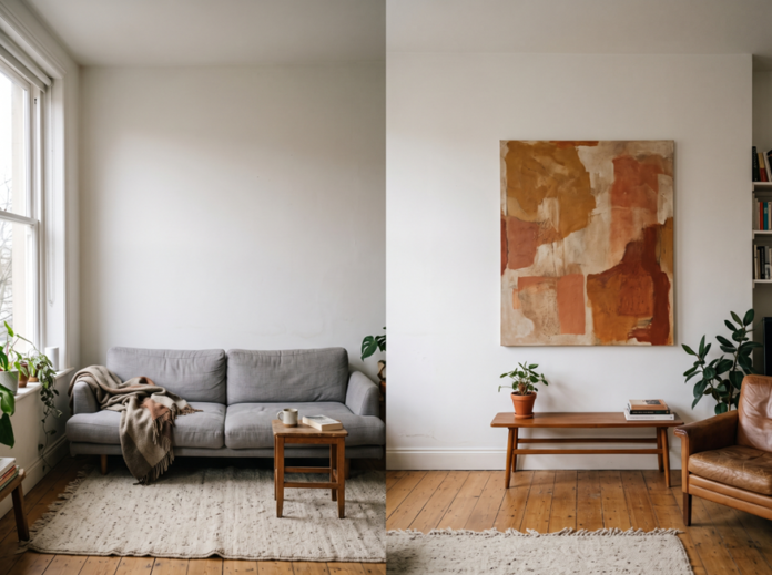

Most people redecorate the furniture, repaint the trim, maybe swap out a rug, and leave the walls for later. Later rarely comes. The couch gets replaced twice before anyone hangs a single piece of art, and the walls stay exactly as blank as they were on move-in day.
That’s a missed opportunity, not a neutral choice. A bare wall isn’t a blank slate waiting patiently for your attention. It’s doing something to the room right now, and usually what it’s doing is making the space feel unfinished, cold, or generic. This isn’t about chasing whatever’s trending on your Instagram feed this month. It’s about a handful of decisions, mostly around size, color, and material, that determine whether a piece of art pulls a room together or just sits there looking like an afterthought.
Why Your Walls Are Doing More Than You Think
Most people in cities spend more than 90% of their time indoors, and that fact alone makes the choices you make about your indoor environment far from trivial. Research on interior architecture and mental health backs this up: people report measurable psychological responses to the spaces they occupy, and those responses happen fast. Your brain reads color and visual texture in a room almost instantly, well before you consciously register what you’re looking at.
That means the empty stretch of drywall above your sofa isn’t neutral. It’s registering as unfinished every single time you walk past it. Once you start hunting for paintings on canvas for sale, you start noticing which pieces actually change how a room feels versus which ones just fill space. A good painting doesn’t just decorate a wall. It gives your eye somewhere to land, and it gives the room a mood you can point to.
This is the real argument for treating wall art as a design decision instead of a decorating chore you get to eventually, an argument Marymount University’s research on interior design and wellbeing makes in clinical terms: the room already has a psychological effect on you whether or not you’ve chosen it on purpose.
Get the Size Right Before Anything Else
Before you think about color palettes or subject matter, get the scale right. Undersized art is the single most common mistake people make, and it’s an easy one to avoid once you know the rule.
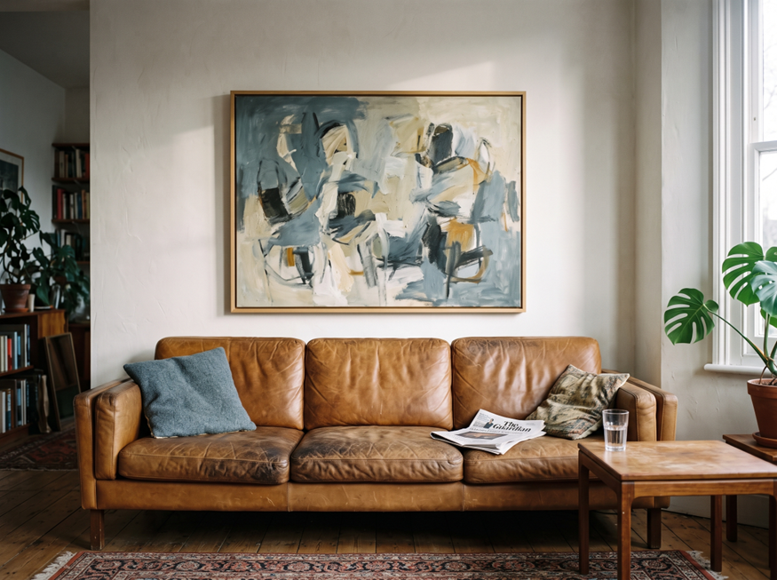
A good rule of thumb, echoed by Pottery Barn’s design guidance, is that your art should span roughly two-thirds to three-quarters of the furniture width below it. Hang a 20-inch canvas over an 84-inch sofa and the piece reads as an afterthought, something you grabbed on the way out of a store rather than something you chose. Scale it properly and the same painting anchors the whole seating area.
Height matters just as much. Center art at roughly eye level, about 57 to 60 inches from the floor to the middle of the piece, and leave 6 to 8 inches of breathing room between the top of a sofa and the bottom of the frame. Too high and the piece floats disconnected from the furniture below it. Too low and it feels cramped, like it’s fighting the couch for space.
If you’re working with a narrow hallway or a small home office, the two-thirds rule still applies, just against a smaller reference point, such as a console table or a desk rather than a full sofa.
Match the Mood to the Room
Color does real psychological work, and different rooms call for different emotional registers. A living room can carry a bold, saturated piece because it’s a social space built for energy and conversation. A bedroom needs the opposite treatment.
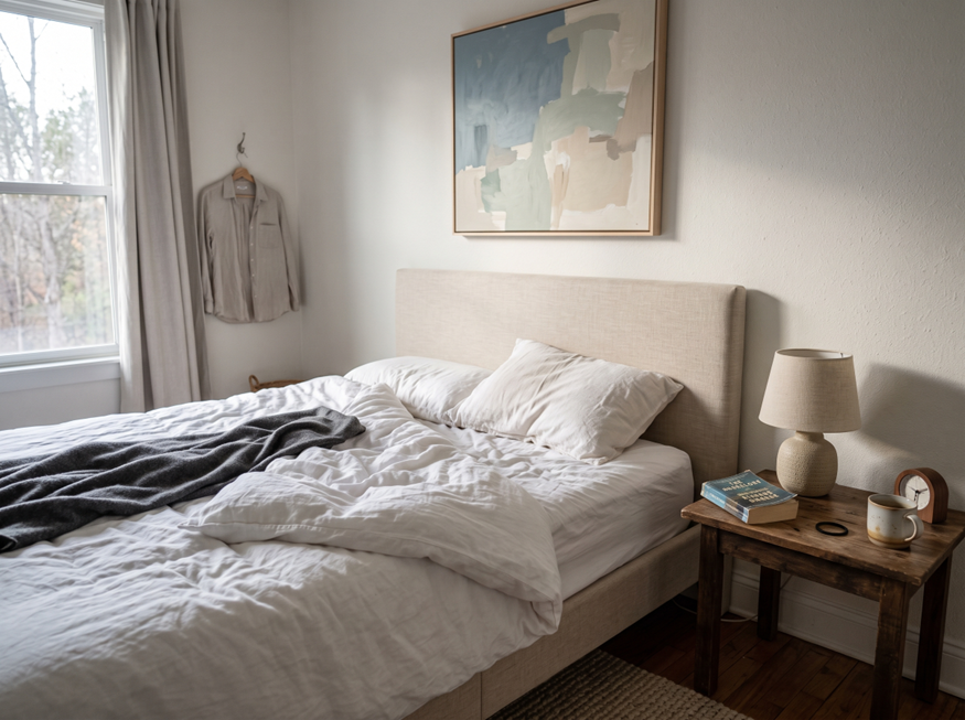
Cool, muted tones, think dusty blues, soft sage, warm grays, support a calmer, more restful atmosphere in a space meant for sleep. A home office benefits from something in between: energizing without being distracting, which usually means abstract work with movement but not chaos. Dining rooms and entryways can afford to be bold since guests only spend a few minutes there at a time, so a conversation-starting piece works harder than it would in a room you sit in for hours.
None of this is arbitrary. It follows from the same color-response research that explains why hospitals paint recovery rooms in soft blues and gyms lean toward energetic reds and oranges. Your home doesn’t need a clinical color strategy, but matching a room’s function to its dominant tones makes the whole house feel more intentional.
Choosing Real Canvas Over Mass-Produced Prints
Texture is one of the bigger stories in home decor for 2026, and it’s changing how people think about what belongs on their walls. A flat, glossy print photographs fine for social media but looks thin in person, especially up close.
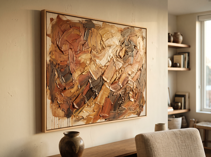
A Statista survey found that 74% of UK homeowners now prefer bespoke decor that feels emotionally meaningful over anything mass-produced, and separate Houzz UK data shows more than 68% of homeowners are prioritizing natural materials throughout their homes. Canvas with real texture, visible brushwork, and physical depth fits both of those preferences in a way a flat print simply can’t. Light hits it differently depending on the time of day, and it holds up to close inspection instead of revealing itself as a printed sheet the moment you get within a few feet.
Sanne Hamers, whose path from styling into interior design has shaped a lot of her thinking on curated interiors, has talked about how a single well-chosen piece can carry more weight in a room than a dozen smaller decorative objects combined. That instinct holds up: one textured, handmade canvas does more for a room’s warmth than a wall full of mass-produced prints ever will.
One Statement Piece Beats Ten Small Ones
The “less but bolder” approach has become one of the dominant threads in 2026 interior design, and it’s a welcome correction to years of over-decorated gallery walls. A single oversized canvas, hung with intention, reads as confident. A cluttered arrangement of six mismatched small prints usually reads as indecisive, even when each individual piece is nice on its own.
This connects to a broader point about design philosophy: luxury design isn’t about expensive materials, it’s about restraint and intention. A single statement painting, properly scaled and thoughtfully placed, communicates more confidence than a wall crowded with a dozen smaller pieces competing for attention. If you’re staring at a gallery wall wondering whether it’s working, there’s a decent chance the honest answer is that one large piece would do the job better.
That doesn’t mean gallery walls are wrong. Some spaces, particularly stairwells and long hallways, genuinely benefit from a grouped arrangement. But for the main focal walls in a living room or primary bedroom, one well-chosen piece almost always outperforms a cluster of smaller ones.
A Simple Checklist Before You Buy
A few practical checks before you commit to a piece can save you from a return, a rehang, or years of low-grade dissatisfaction with a wall you rarely look at anymore:
- Measure the wall and the furniture beneath it, and aim for that two-thirds proportion
- Pull the undertone colors already in your room, rather than starting from scratch
- Decide upfront whether you want one statement piece or a curated grouping, and commit to it
- Check the material. Texture and canvas depth photograph and age differently than flat prints
- Trust your own reaction to a piece over whatever’s trending this season
The wall art market isn’t a niche corner of home decor anymore. It’s projected to grow from roughly $67 billion in 2025 to nearly $119 billion by 2032, which tells you plenty of people are already treating this as a serious design category rather than an afterthought. Getting the fundamentals right now means you won’t be rehanging things in two years once the trend cycle moves on.
The Takeaway
Choosing wall art isn’t decoration you get around to eventually. It’s a design decision that measurably affects how a room feels and how it functions, from the mood you carry into a bedroom to the impression guests form the second they walk through your front door.
Skip the trend-chasing and work from the framework instead: get the size right, match the tone to the room’s purpose, choose real texture over flat prints, and don’t be afraid to let one strong piece do the work of ten smaller ones. The walls were never neutral to begin with. You might as well make them work for you.