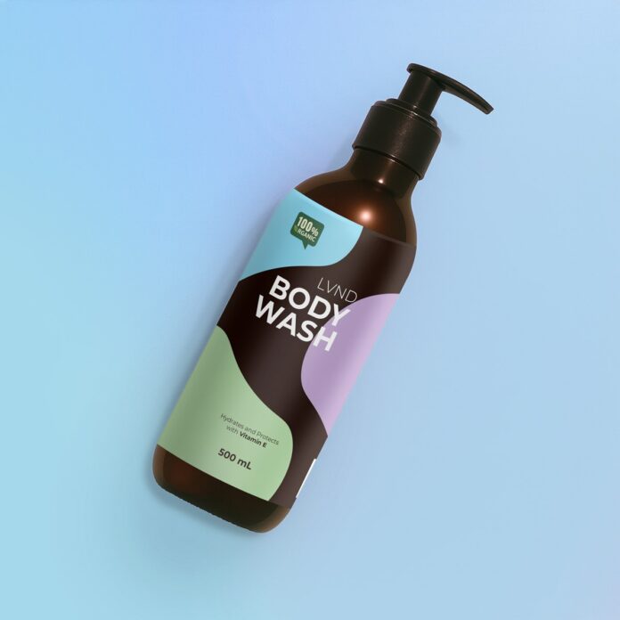

Your artwork looked perfect on screen. Then the custom sticker labels arrived; you applied the first one to a bottle, and something felt off. The text sat at a slight angle. One edge lifted. The logo you spent hours positioning now looks squashed on one side. Nothing was wrong with the printing. The problem started earlier, back when the design was built for a flat rectangle rather than a surface that bends away from the eye.
Here is the thing most people miss about custom sticker labels. A screen shows your design head-on, evenly lit, with every millimetre visible at once. A curved bottle shows maybe sixty per cent of that label to anyone looking at it. The rest wraps out of sight. Your design has to work within the part people can actually see, and that visible zone is smaller than you think.
Why Curved Surfaces Change What Readers See
Pick up a shampoo bottle. Look at it straight on without turning it.
You are reading a narrow strip. Everything past that strip curves away and distorts. Letters near the edges appear compressed even though the print is fine.
That compression is not a printing fault. It is geometry doing what geometry does.
On a 60mm diameter bottle, the readable face is roughly 40mm wide. Anything you place outside that band exists but does not communicate.
Designing Sticker Labels for Bottles and Jars
The fix is not complicated once you accept the constraint.
Keep your important content central. Brand name, product name, anything a buyer needs in the first second. Push those toward the middle third of the label.
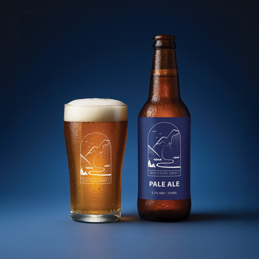
Use the outer areas for things that tolerate distortion:
- Background colour or texture. Curves do not damage flat colour.
- Ingredient lists and legal text. People turn the bottle to read these anyway.
- Repeating patterns. Distortion barely registers on a repeat.
- Barcodes. Place these on the flattest available section, never across a tight curve.
One small thing I learned watching someone apply their first order. They had centred a wide logo perfectly. On the bottle, the last two letters vanished around the side. The design was not wrong. The placement was.
Sticker Label Application on Tight Curves
Small diameters cause a different problem. Adhesion.
A sticker wants to lie flat. Wrap it around something narrow, and the material fights back, pulling at the corners. Lip balm tubes, sample vials, and slim cosmetic bottles all sit in this category.
Two things reduce the trouble.
Smaller labels wrap more easily than large ones. A shorter label has less stored tension trying to peel it back.
Rounded corners help too. Square corners give the peel somewhere to start, which is why so many bottle labels have softened corners.
Apply from the centre outwards, smoothing as you go. Starting at one edge builds a wrinkle you cannot remove.
Choosing Material for Curved Bottle Labels
Material affects how well a sticker follows a curve.
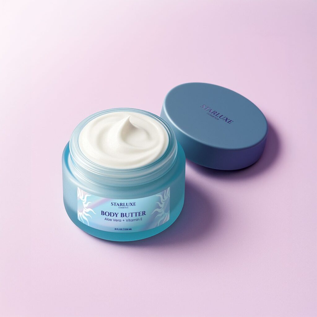
Synthetic stock like polypropylene handles bending without cracking, which suits drink bottles, cosmetic packaging, and anything that lives in a fridge or bathroom. It copes with moisture and handling, and it stays put when the surface sweats. Worth knowing it is built for indoor use, so it is not the answer for products that live permanently outside.
Source: https://drive.google.com/drive/folders/1rgsDWjtArEm-cJqOkZRPSQ5sIVORohTi
Paper stock behaves differently. It sits nicely on gentle curves and reads as more artisan, but tighter radii can cause creasing along the wrap.
Test before committing. Order a small quantity, apply one to the actual bottle, then decide.
Proofing Your Design Before the Full Run
This step saves more money than any other.
Print your artwork at actual size on ordinary paper. Cut it out. Tape it to the bottle you plan to use.
Look at it from a metre away. Turn it slowly. Ask yourself what disappears.
Most problems reveal themselves in about thirty seconds. Text too close to the edge. A logo that needs to be twenty per cent smaller. Contrast that dies under bathroom lighting.
You can upload adjusted artwork and get a fresh quote in minutes, so there is no real reason to skip this.
Common Mistakes with Curved Sticker Label Design
A short list worth checking your file against:
- Text running to the very edge with no safe margin.
- A wide horizontal logo on a narrow bottle
- Fine detail is placed where the curve compresses it
- Barcodes are positioned across the steepest part of the bend.
- Labels sized to fill the bottle rather than to fit the readable face
That last one catches people constantly. Bigger does not mean more visible.
Getting It Right on Your Next Order
Design for the bottle in front of you, not the rectangle on your screen.
Measure the diameter. Work out the readable band. Keep what matters inside it, and let the edges carry the parts that survive distortion.
Then test one before ordering a hundred. Perhaps that sounds obvious, though the number of orders that skip it suggests otherwise.