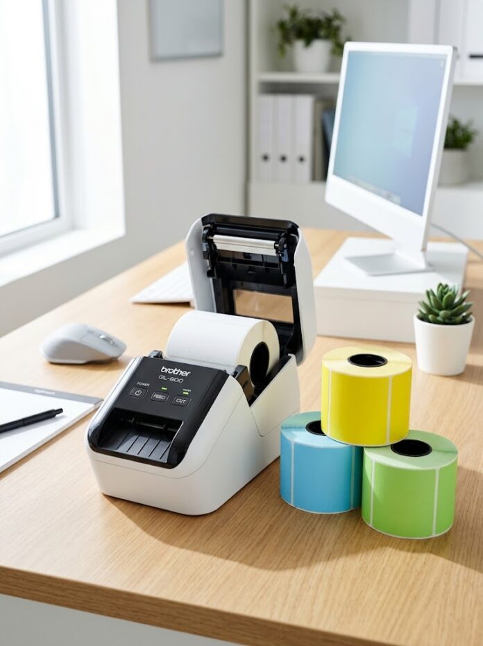

Colored DK-1202 labels can make order categories more visible, but the color must not reduce the readability of text or barcodes. The label size remains about 2.4 by 3.9 inches, and the printer still produces dark thermal marks on the colored stock. Use color as a second signal for an internal workflow, not as the only way to communicate service level or package status. If the label carries a carrier barcode, confirm the carrier’s material and contrast requirements before using colored media.
Assign one meaning to each color
Begin with a small number of categories that workers can remember and verify. For example, one color may indicate local delivery and another quality review. Print the category name in clear text on every label. This prevents mistakes when a roll is loaded incorrectly, lighting changes, or a staff member cannot distinguish two colors. Avoid creating so many shades that a picker must stop to interpret the key.
Put the color rule in the packing procedure. A new worker should be able to tell whether color is applied at picking, packing, or dispatch. If the same color means different things in different departments, it will eventually create a misroute. A simple printed word and a short code should remain authoritative when color and text disagree.
Test the barcode against each background
Do not approve the media based on a screen mock-up. Print representative labels in every color you plan to use. Include the longest tracking or internal barcode, the smallest expected text, and any dense code. Scan with the actual devices at normal distance and speed. Check whether any background makes the dark print less distinct. A bright label that attracts attention can still be a poor barcode carrier if contrast is marginal.
Use the same print density initially for all samples. If one color fails, inspect code size, quiet zone, and head condition before simply increasing density. Too much heat can cause narrow barcode spaces to close. If a carrier requires black on white, keep the official shipping label white and place a separate colored internal marker nearby. That makes color useful without changing a controlled carrier format.
What should be printed besides the color
Print a short status word or code in a consistent location. Color can signal urgency quickly, but text confirms the exact meaning. For example, two departments may both consider an order important but require different actions. A word such as REVIEW or RUSH removes ambiguity. Keep the status away from the tracking barcode so it does not interfere with scanning. If the label is customer-facing, make sure the status text is appropriate for that audience and does not expose internal notes.
How can you avoid wrong-color batches
Use a named print queue or template for each category, and require the operator to verify the loaded roll before starting a batch. Print one label, compare its text and color with the order list, then release the rest. If the printer is shared, place unused colored rolls back in labeled storage rather than leaving them at the workstation. For a high-volume process, track roll changes in a short log. This makes it easier to determine whether a sorting error came from the data, the template, or the stock loaded at the time.
Does a color label replace a carrier label
No. A colored internal status label can accompany an official shipping label, but the latter should remain in the format specified by the carrier. Do not place a colored marker over the carrier barcode, address, or routing marks. Put it on another flat part of the carton where staff will see it during packing. If space is limited, consider adding a status line to an internal packing slip instead. The best implementation makes the extra cue visible without creating a second barcode or conflicting destination information.
Example of a priority color that should not appear on a carrier label
An online store wants a red background for urgent parcels. The carrier supplies a black-on-white tracking label, while the team uses DK-1202-sized colored stock for internal sorting. Keep the official carrier label unchanged. Print a separate colored status marker with the order number and URGENT text, then apply it where the packer and dispatcher will see it. Do not place the marker over the tracking code or destination address. During a pilot, verify that workers notice the marker and that it does not introduce a second ambiguous barcode. If no measurable reduction in missed priorities occurs, improve the order queue or staff procedure rather than assuming that brighter paper alone will solve the problem.
Final approval question
After a small pilot, ask whether staff can correctly explain each color’s meaning without consulting a chart. Compare mis-sorts and missed priorities with the previous process. If performance does not improve, keep the useful text and revise the workflow rather than adding more colors. A label should communicate an action, not merely decorate a parcel.
Keep stock changes under control
In a shared QL printer, the next job may not use the color currently loaded. Require a quick check of label color and media profile before batch printing. Store rolls in clearly named locations and keep the cartridge frame with the correct stock. If the software template says white while the printer holds colored paper, the dimensions may still match and no error will appear. The human preflight step is therefore essential.
Measure whether color actually improves the process. Track mis-sorted orders or time spent identifying priority packages before and after the change. If the count does not improve, the problem may be unclear status definitions or poor placement rather than label color. Test on a small batch before standardizing all orders.
The DK-1202 colored shipping labels listing describes a 2.4 by 3.9-inch compatible format with 300 labels per roll. For other direct thermal labels, compare physical size, contrast, and application surface. A color system succeeds when it makes a correct decision faster and still passes the same print-and-scan checks as plain stock.