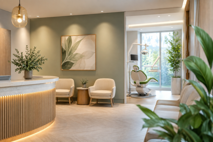

Walk into a dental clinic and the room speaks before anyone says a word. Sometimes it whispers calm. Sometimes it feels a bit too sharp, a touch clinical, and suddenly the shoulders creep up near the ears. Colour has a funny way of doing that. It gets in quietly and sets the mood long before the first appointment sheet is filled out.
For dental practices across Australia, that matters more than most people realise. A well-chosen palette can make the space feel less like a place of dread and more like somewhere people can breathe again. That is no small thing when a patient is already feeling jumpy from the drive over, the parking hunt, or the thought of a drill somewhere nearby.
Why colour matters more than a fresh coat of paint
Colour does not just decorate a room. It shapes behaviour, mood, and even the pace at which people settle. In healthcare spaces, this becomes especially useful. The right tones can soften anxiety, make waiting feel less like waiting, and give the whole practice a sense of care without saying a single word.
Dental clinics are a special case. People often arrive with guarded expressions, arms folded, mentally preparing for the unknown. A harsh white room can make that worse. Soft neutrals, muted greens, warm greys, and gentle blues tend to ease the tension a little. They make the place feel more human, less like a lab.
There is also a practical side to it. Australian clinics deal with strong natural light, different local climates, and plenty of glare, especially in cities with large windows and open façades. A colour that works nicely in a magazine spread might look icy or washed out under bright Sydney sun or the warmer light common in Perth. That is where thoughtful planning earns its keep.
How patients read a room without even meaning to
People make snap judgements about a space in seconds. They may not say it out loud, but they feel it. Is this place sterile? Is it kind? Is it calm? Can I relax here?
That instant reaction often comes from colour. Pale blues suggest cleanliness and steadiness. Soft greens bring a bit of nature indoors, which tends to lower tension. Warm neutrals, especially beige, sand, and muted clay tones, can stop a room from feeling cold. Those tones work well in Australian settings where the goal is often comfort without fuss.
Bright, saturated colours have their place too, though they need a careful hand. A strong yellow or red can feel lively in a café, but in a dental clinic it may nudge the nerves in the wrong direction. Nobody wants the colour of a warning sign when they are waiting for a cleaning.
Subtle choices that do a lot of work
Small colour decisions can carry a surprising amount of weight:
Muted blues support calm and trust
Sage and eucalyptus greens create a gentler connection to nature
Warm whites keep spaces clean without feeling harsh
Soft timber tones balance the clinical edge
Charcoal accents add structure without making the room feel heavy
These choices work best when they are not trying too hard. The trick is to guide the mood, not stage a dramatic performance. A clinic does not need to look like a spa to feel reassuring. A bit of restraint goes a long way.
Local context: what works in Australian clinics
Australia is not one neat little box. A practice in Brisbane faces different light, heat, and architectural styles than one in Hobart or Adelaide. Coastal clinics often lean into cooler palettes to echo the sea and sky. Inland practices might find warmer neutrals suit the environment better, especially where harsh sunlight can make cool whites feel a bit brittle.
Then there is the cultural side of it. Australian patients often appreciate spaces that feel relaxed but professional, polished but not stiff. There is a general dislike for anything that feels overly formal or chilly. A clinic that feels approachable, with colour choices grounded in local taste, tends to land better.
Regional design trends also shape expectations. In many parts of Australia, natural textures are well loved. Pairing colour with timber finishes, stone details, or soft matte surfaces helps the whole interior feel settled. It is a bit like putting on a good jacket that just fits right. Nothing flashy, just easy on the eye.
Balancing hygiene with warmth
Dental spaces have to look clean. That part is non-negotiable. Yet there is a difference between clean and cold. Too much stark white and chrome can make a room feel more like a storage bay than a place of care. That is where colour psychology steps in and saves the day.
A practical dental fitout often uses layered colour to soften the sterility. The walls may stay light for freshness, while the furniture, joinery, and artwork bring in warmth. Even a small shift, like replacing pure white with a soft cream or pale stone tone, can change the feel of a room quite a bit.
Lighting also plays a role here. Under cool LED light, some colours can turn flat or blue. Under warmer light, others may look richer and more inviting. It pays to test palettes under the actual lighting conditions rather than trusting a paint chip under a shop’s perfect display lamps. Those things can be sneaky.
Colour choices by room type
Not every part of a clinic should feel the same. Different spaces do different jobs, and colour can support each one.
Reception
This is the first proper interaction with the space, so it should feel calm and organised. Soft neutrals paired with a grounded accent colour can help the desk feel welcoming without looking fussy. A gentle blue-grey or sage backdrop often works well.
Waiting area
Waiting rooms are tricky. They need to distract without overstimulating. Earthy tones, nature-inspired art, and textured finishes can help the area feel more like a lounge than a holding pen. Nobody enjoys a room that makes them count ceiling tiles.
Treatment rooms
Here, the goal is calm focus. Clean light tones, with restrained accents, help keep the environment steady. Strong colours near the chair can feel distracting, so many practices keep these spaces quieter in tone.
Consultation rooms
These need a bit more warmth and trust. Muted greens, soft wood finishes, and balanced lighting can encourage conversation. Patients often open up more when the room feels composed rather than severe.
Why the wrong colours can backfire
It is easy to get carried away with style. A trendy palette may look excellent on a design board, then fall flat once the clinic opens. Overly bright tones can make nerves worse. Too many competing colours can make the whole place feel busy in the wrong way. And heavy dark shades, if used without care, may shrink the room and make it feel less welcoming.
There is also the risk of making everything look too much like every other clinic. Generic white-and-blue interiors can feel tidy, but they rarely leave much of an impression. A thoughtful palette gives a practice some character, which can be a real advantage in a competitive market. People remember how a place made them feel, even if they never mention the paint colour.
Small touches that make a big difference
Colour psychology is not only about walls. It shows up in cabinetry, seating, signage, artwork, flooring, and even the colour of a planter in the corner. A clinic that uses colour consistently feels more considered. Not staged. Just looked after.
For Australian practices, it often helps to lean on natural references. Coastal blues, sandy neutrals, gum leaf greens, and warm timber hues connect well with the local landscape. These are familiar, comforting colours. They feel like they belong here, which quietly puts people at ease.
And that ease matters. Dental anxiety is real, and no amount of cheerful posters can fully erase it. Still, a space that feels gentle can make the experience less intimidating. It gives patients one less thing to brace against.
A calmer experience starts before the appointment begins
When colour is chosen with care, the clinic does more than look polished. It starts working on people the moment they step through the door. The room steadies the mood. The nerves settle a touch. The whole experience feels a bit more manageable.
For dental practices in Australia, that balance between professionalism and warmth is worth chasing. Good colour choices support trust, comfort, and clarity without shouting for attention. They quietly do their job, which is often the mark of the best design decisions.
And if that means fewer anxious glances at the ceiling and a bit more relaxed breathing in the waiting room, well, that seems like a win all round.